move us around! refresh for new colours :)
IKEA Home Collab 🛌
🛌
IKEA Home Collab
UX + INTERACTION DESIGN / 8 WEEKS / FALL 2020
A collaborative experience for couples designed to consolidate clashing opinions and develop a shared understanding of home:
IKEA Home Collab concept video
TL;DR - we identified intervention areas through rapid sprint processes and user testing to reduce the chances of arguing over how shared spaces should feel, while leveraging IKEA's online showroom and e-commerce experience.
Team
Jin Lin Li, Michelle Shen, Gillian Tsang, Hilary Lui
Role
User Research + UI
I conducted ongoing user tests to evaluate the effectiveness of our solution and developed the UI of various pages. Specifically focusing on
how the collaborative experience could be further enforced, I worked on the celebratory aspect of checking out products that were selected during the process.
I also worked on updating IKEA's digital showrooms to better align with modern standards.
Context
IKEA Home Collab was completed as a part of a senior-level UX Design course. Over the duration, our team evaluated business problems and
conducted rapid sprint processes to identify and validate potential intervention areas, working closely together to create our final prototype.
view final slide deck
Concept
DEVELOPING PERSONAS / ANALYZING EXPERIENCES
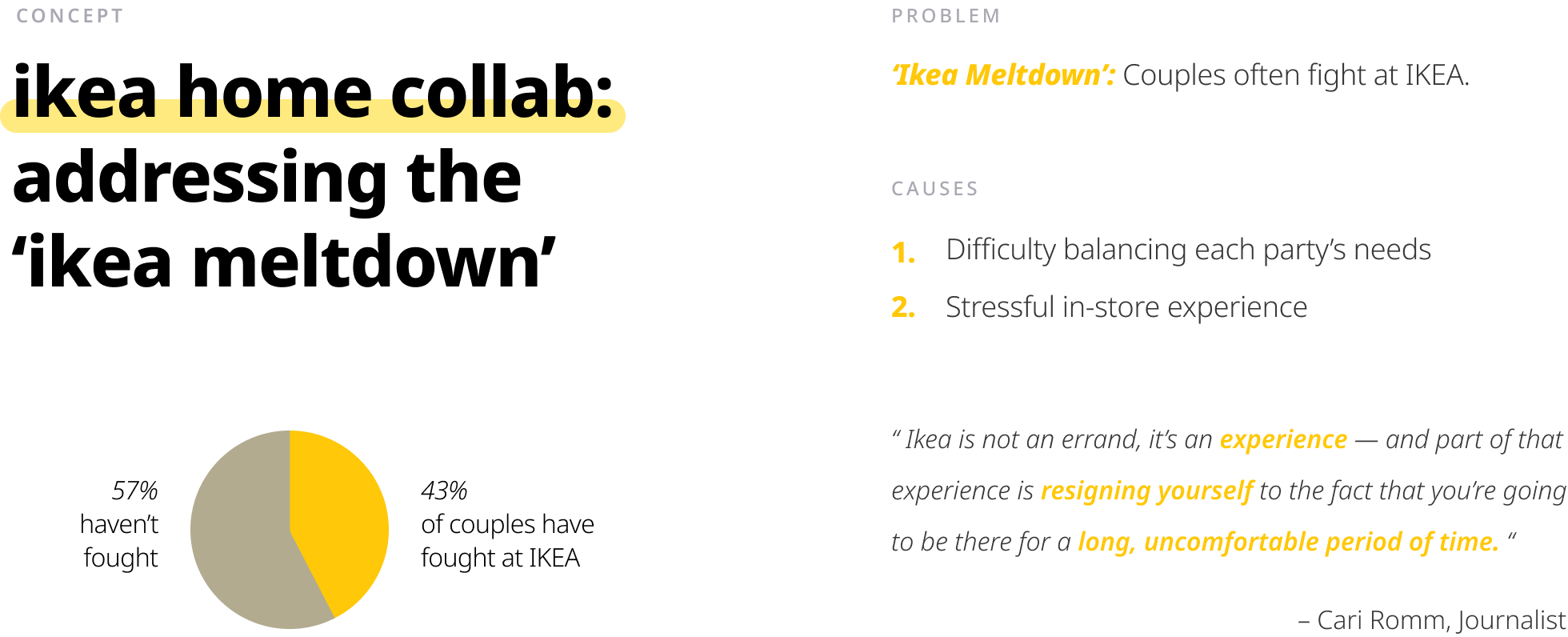
The IKEA Meltdown
The "IKEA Meltdown" is a phenomenon where, due to IKEA's often overwhelming in-store experience, couples find themselves in heated arguments over differences in how they want their space to feel. This can often lead to poor perception of IKEA as they begin to associate these experiences with the products they sell. By offering a visual representation of how their individual styles can come together, we aim to show that compromise shouldn't be necessary to create spaces they both will love.
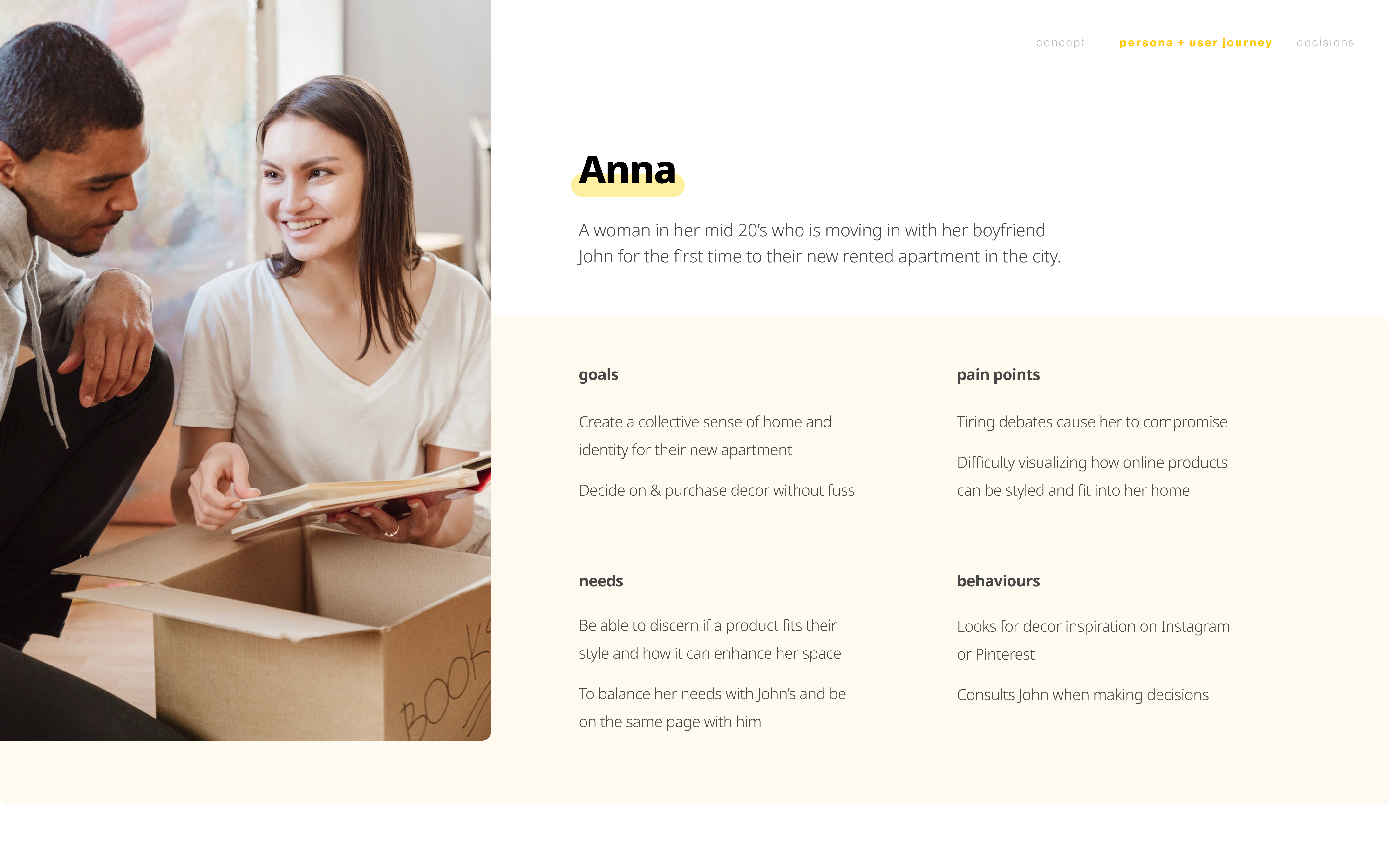
Persona
We identified our target demographic as young couples moving into new spaces together for the first time. IKEA provides cost-effective furniture and home decor options which is ideal for those wanting to build their space from the ground up.
user persona
Reluctant Compromise
Shopping at IKEA can feel like a chore given their in-store setup and overwhelming selection. Although many try to prepare by scouring online for
inspiration and saving what they like, confidence in their journey can quickly diminish once ideas are introduced to their partner.
Through conducted surveys, it was evident that IKEA showrooms were a key factor in seeing how products could work in context. Because of this, disagreements about space
can surface from the inability to visualize an agreed-upon end-goal.
We looked to intervene in the later stages of browsing, consideration, and decision-making to address interpersonal frustrations.
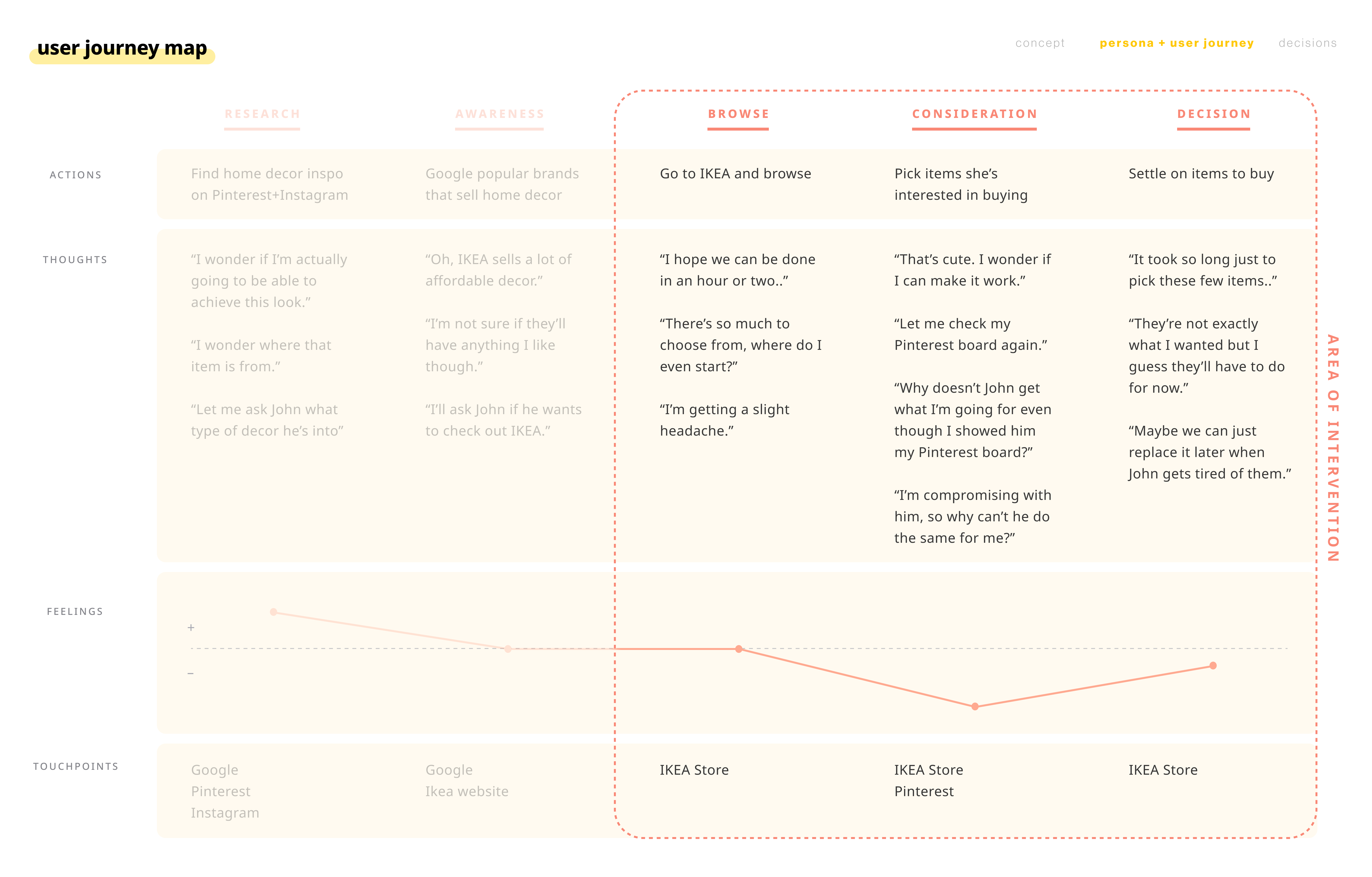
user journey map
Framing
From this, we asked:
How might we help couples satisfy and address both parties' needs for comfort, ownership, and belonging in their shared living spaces?
Refreshing Ikea's Digital Experiences
VISUAL DESIGN & INTERACTION IDEATION
Keeping it Simple
After locking down the collaborative approach to our business problem, we decided on providing a style quiz that would showcase overlapping style preferences from each collaborator.
Our challenge now was to create an experience that remained distinctly IKEA while also refreshing their current online workflow. Our goal was to provide clear and
welcoming visuals to reflect the idea of stress mitigation.
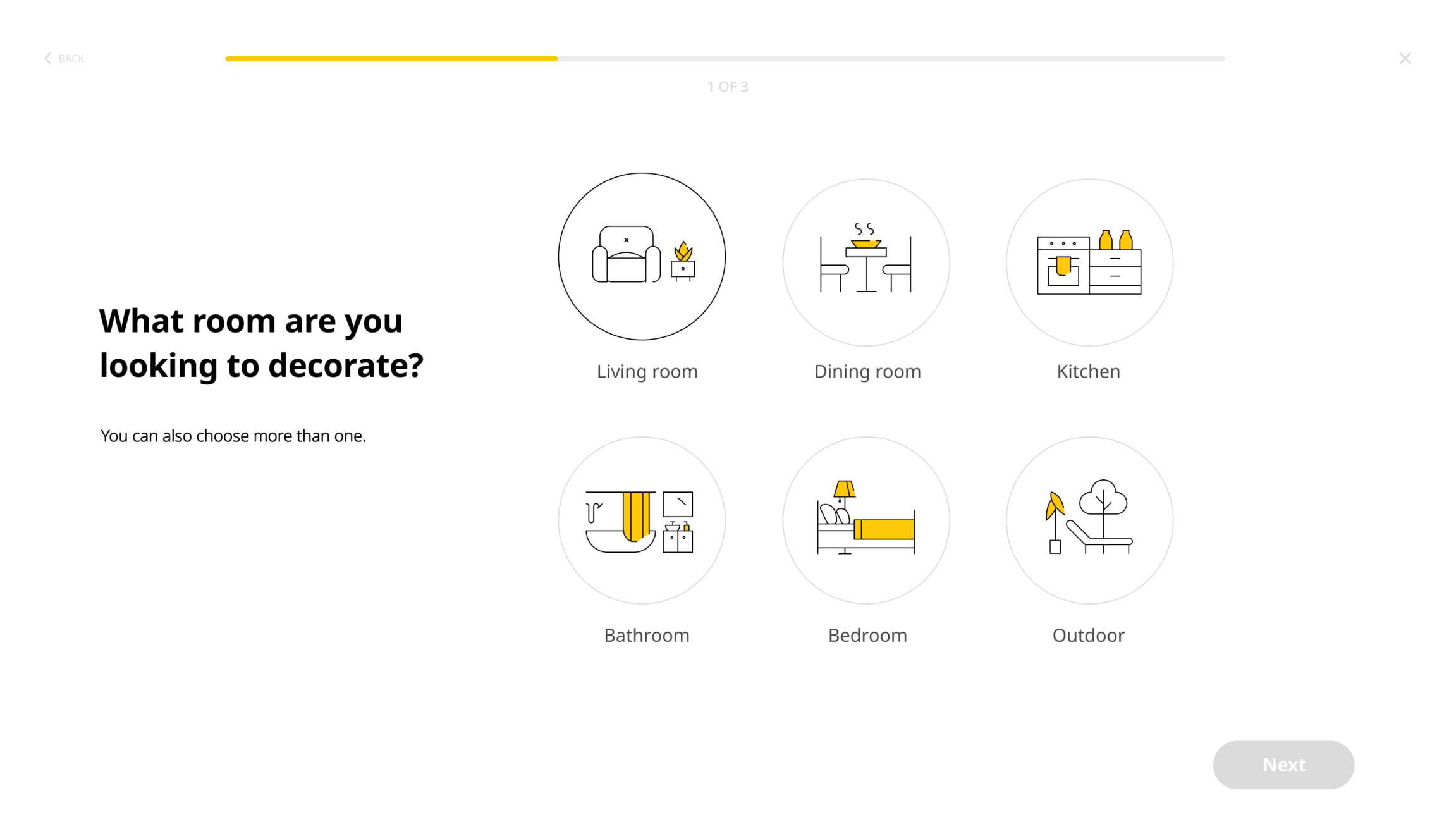
I then created icons for room and style selection pages:
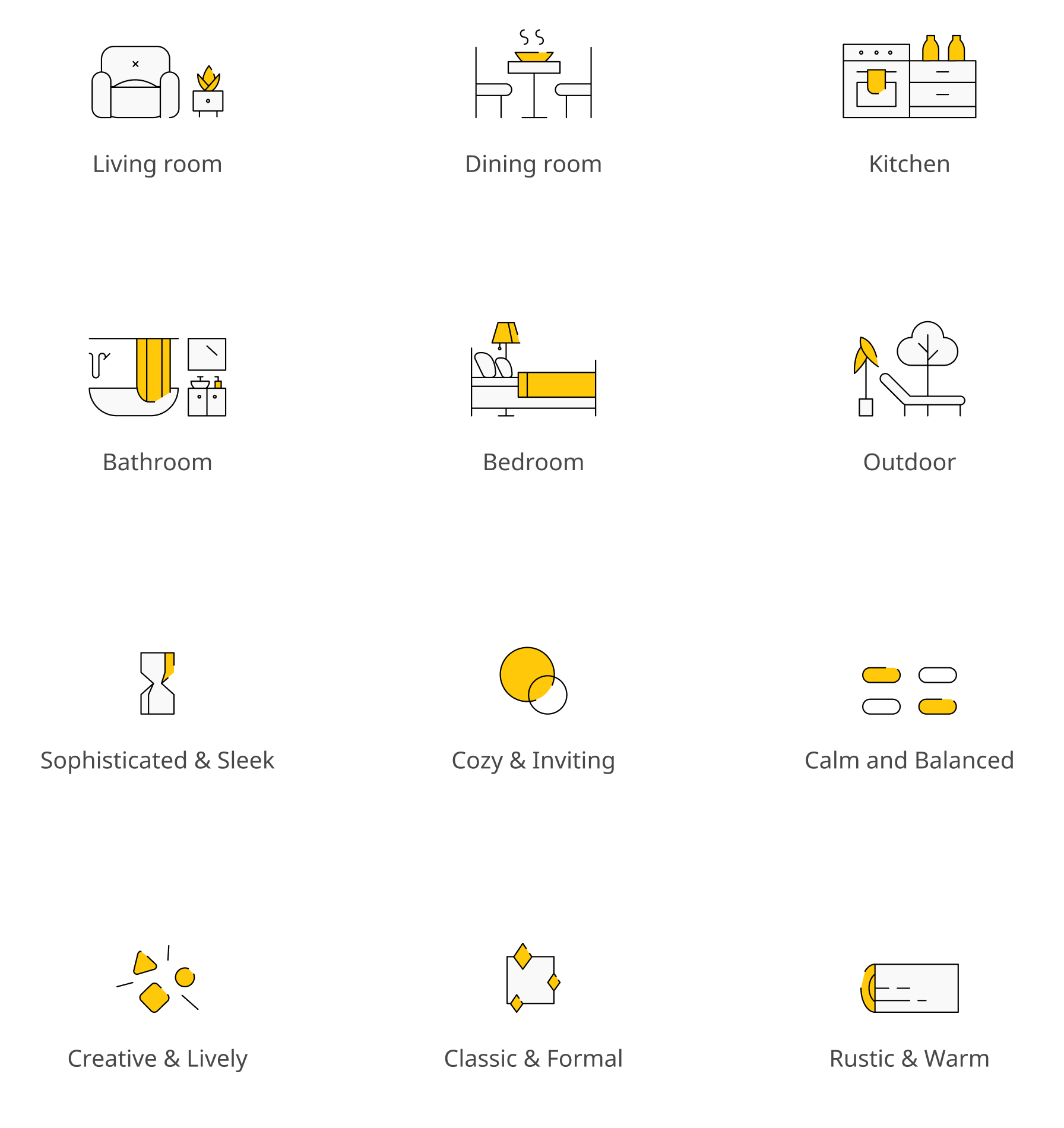
initial icons portraying different rooms and styles
Ensuring Clarity
Our team thought this was a good start, but we were struggling with the potential ambiguity of how the styles were portrayed. We wanted to ensure what users picked actually matched what they had in mind while looking through these options.
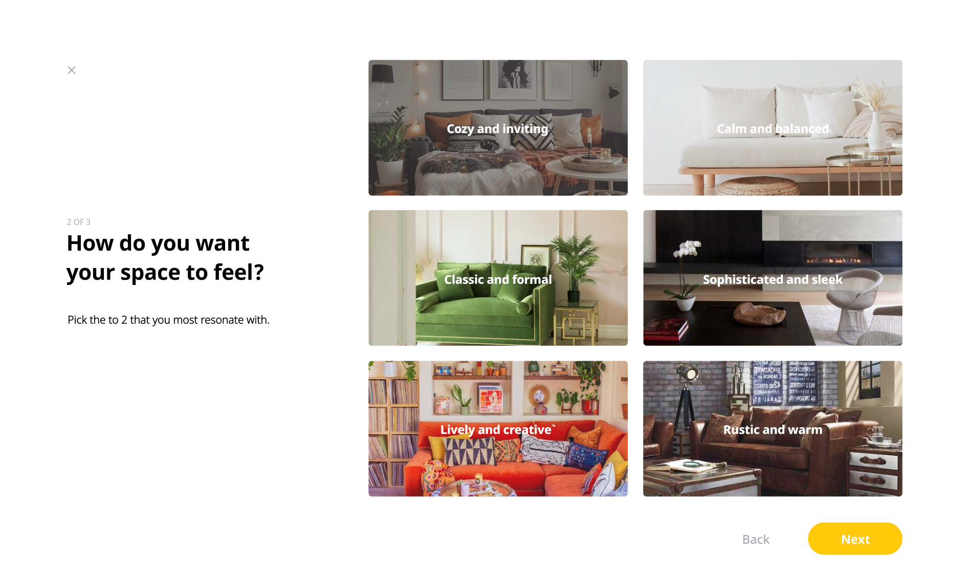
by using images of example showrooms, we eliminate any room for ambiguity when defining preferences
We tested many iterations using a combination of icons and images, but images continued to prove better at showing and not telling. We also took the opportunity to experiment with how we could further modernize IKEA's web experience with more full-bleed pages and darker tones, however, it quickly started to feel too detached from the current brand and no longer 'IKEA'.
UI iterations testing iconography and images
Final Implementation
PRODUCT FLOW / INTERACTION
Anna's user scenario
User Scenario Overview
See how Anna and John use IKEA Home Collab to find products that fit and compliment each other's individual styles.
initial style quiz
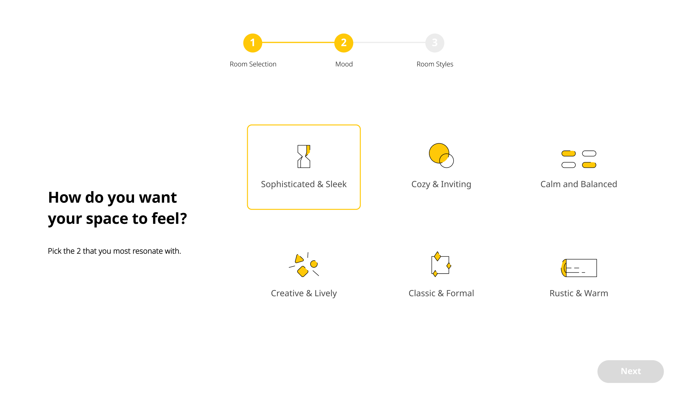
Defining Preferences
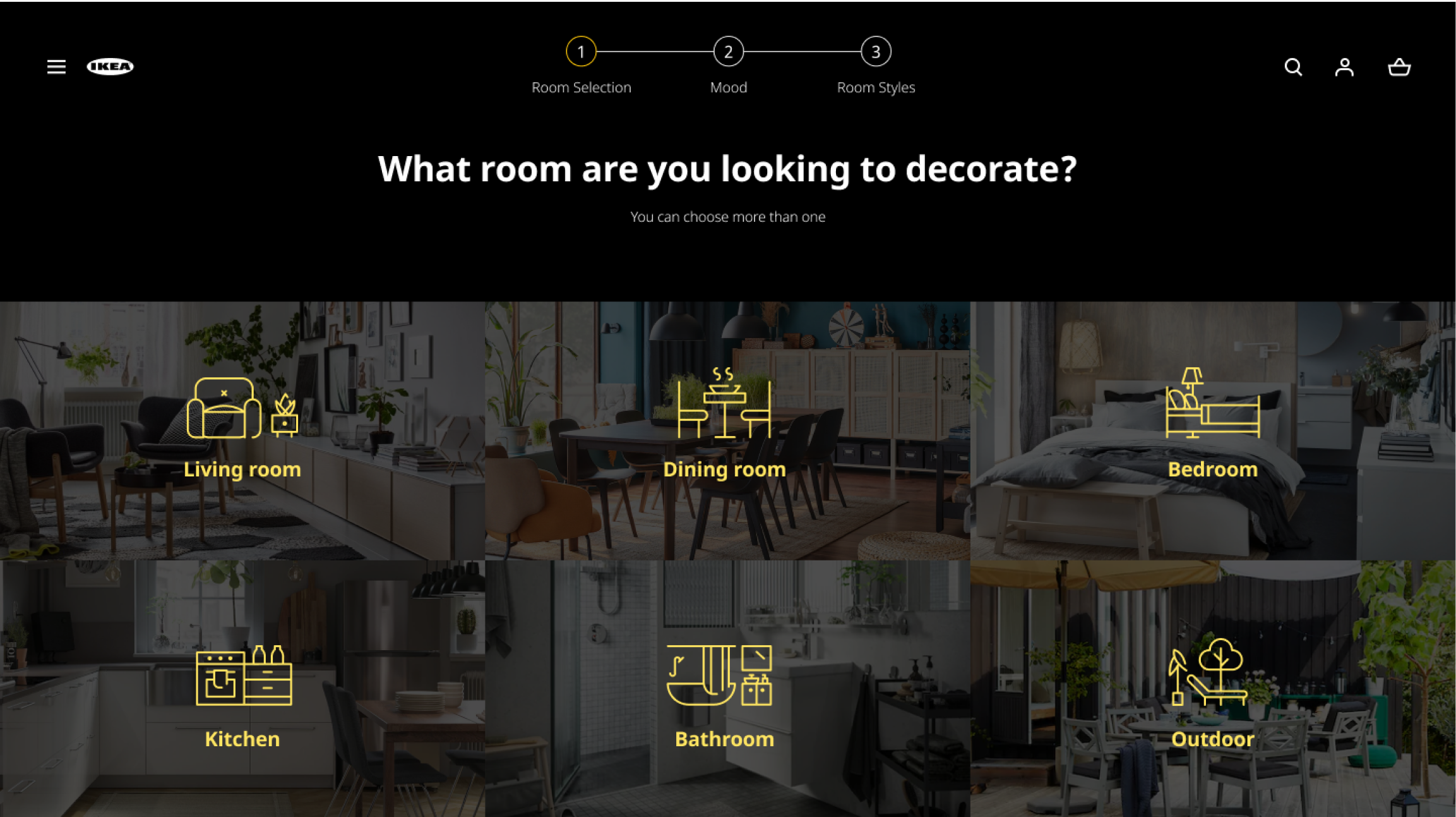
Customers begin by specifying which room they would like to work on. They then individually complete a set of questions identifying which interior decorating style most aligns with their preferences.
browsing you and your collaborator's styles
Mutual Style Spectrum
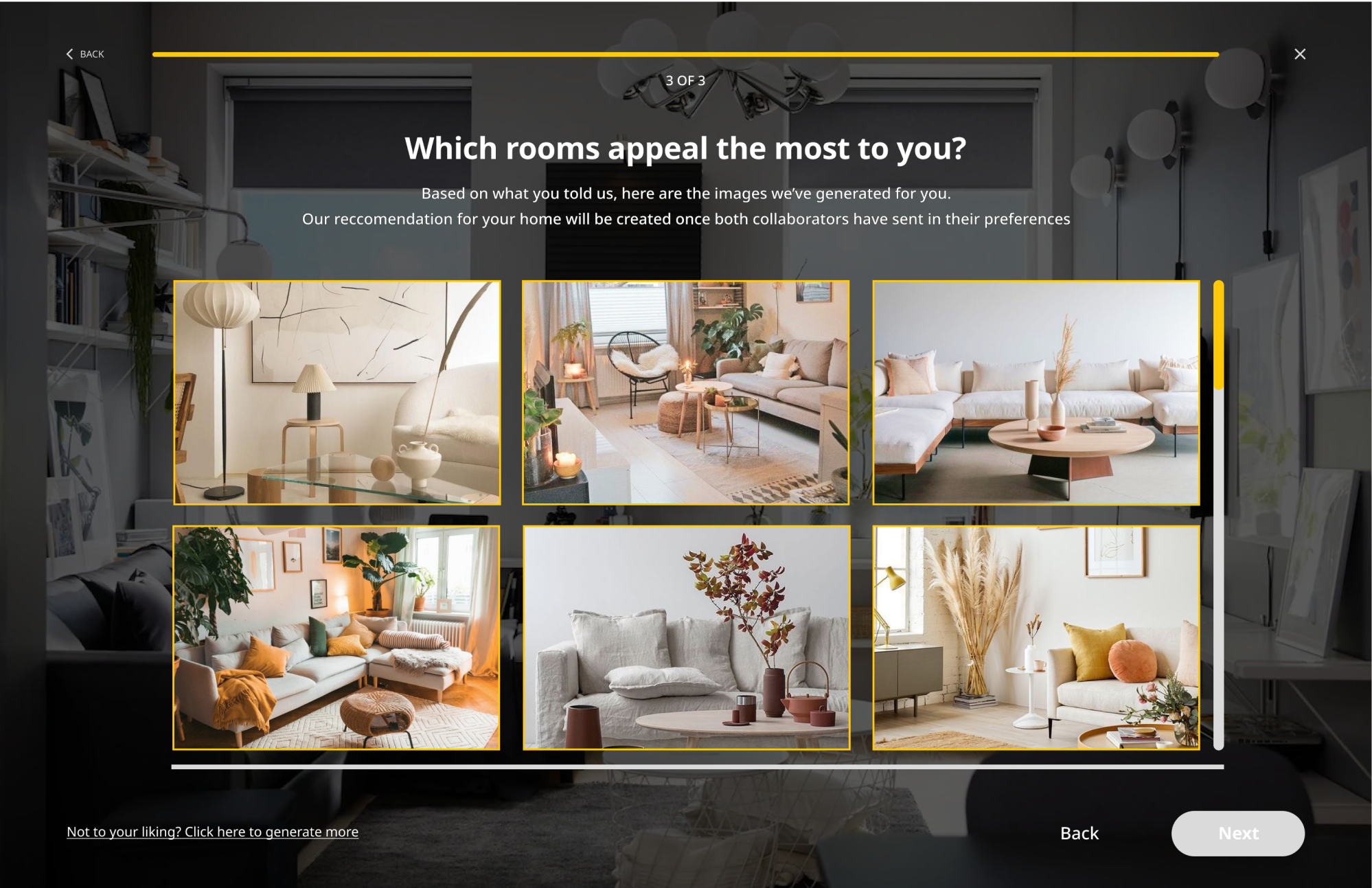
Once each collaborator's preferences are submitted, IKEA generates a visual spectrum with their individual styles on opposite ends.
The spectrum allows customers to go through a range of interior decorating styles while suggesting
a middle ground that incorporates values of each of their preferences.
Customers then submit the ones they like to their collaborator for review.
browsing showrooms
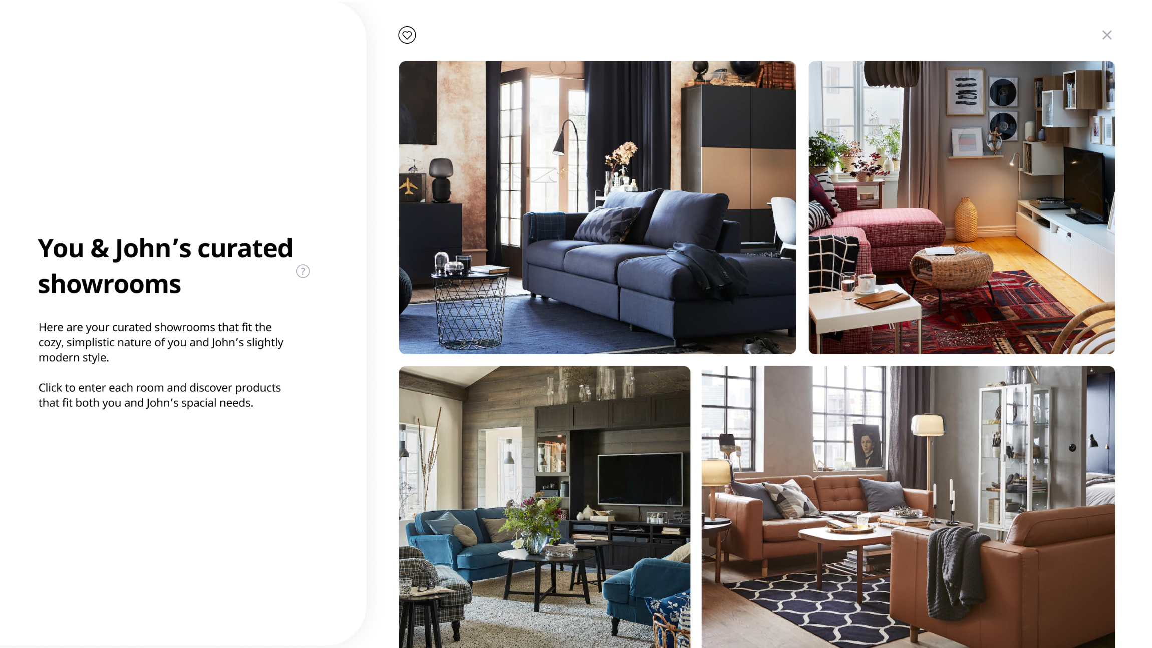
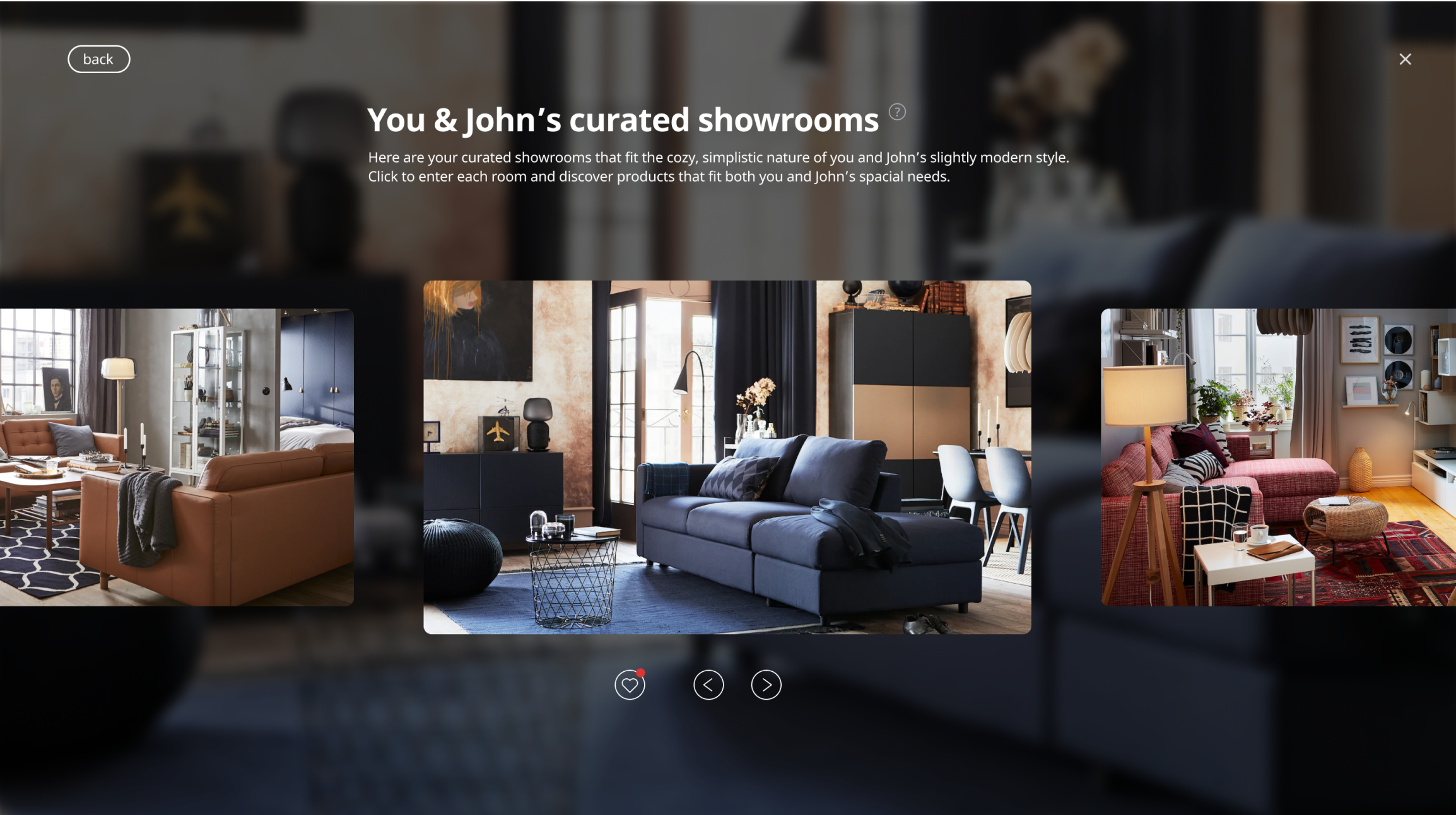
Curated Showrooms
Customers can then browse through a collection of showrooms that embody their decided-upon style. These showroom images are displayed
full-screen for immersion, and to provide a deeper sense of what their space could feel like. Hovering over a product
creates a framed info window, to ensure customer immersion isn't lost throughout the process.
If they come across a product they like, they can add it to their wishlist.
see products in different contexts
Contextual Flexibility
Customers can view alternate product colours without having to navigate to separate pages.
Additionally, if they find a product they're not entirely confident about, they can view them in different
rooms to see how it could match with other items.
product wishlist
Collaborative Review
By allowing customers to view items that the other party liked during checkout as well as items they both liked,
Home Collab encourages customers to give items they didn't wishlist a second thought, and to consider the wants of their collaborator.
This in conjunction with showing recommended items provides multiple opportunities for customers to discover new products, and for IKEA to maximize potential sales.
checkout
Checkout Options that Fit Purchasing Needs
Since it is a collaborative experience, we wanted to ensure customers had appropriate payment options.
They can choose to pay all at once, split the purchase in half, or split the purchase by products.
This further avoids the hassle of calculating and e-transferring post-purchase.
Takeaways
Pushing Forward
The most time-consuming tasks for us involved UI ideation. With this being a school project, we had complete freedom of how
we could design our screens, presenting opportunities that would allow us to provide a fresh take on IKEA's existing
website structure and styling.
My team helped push each other in iterating layouts, developing an understanding
that just because other companies are designing things a certain way, doesn't mean we need to do the same.
Physical Touchpoints & In-Store Experiences
We mentioned in our slides that in the future there could be in-store kiosks dedicated to this solution. If I were to continue working on this project, I would focus primarily on developing this touchpoint further, since it's where arguments happen most often. Preventing arguments before they happen would be critical for IKEA's retail customers.